[Client-based course project]
Lovespace
Visual Identity Redesign
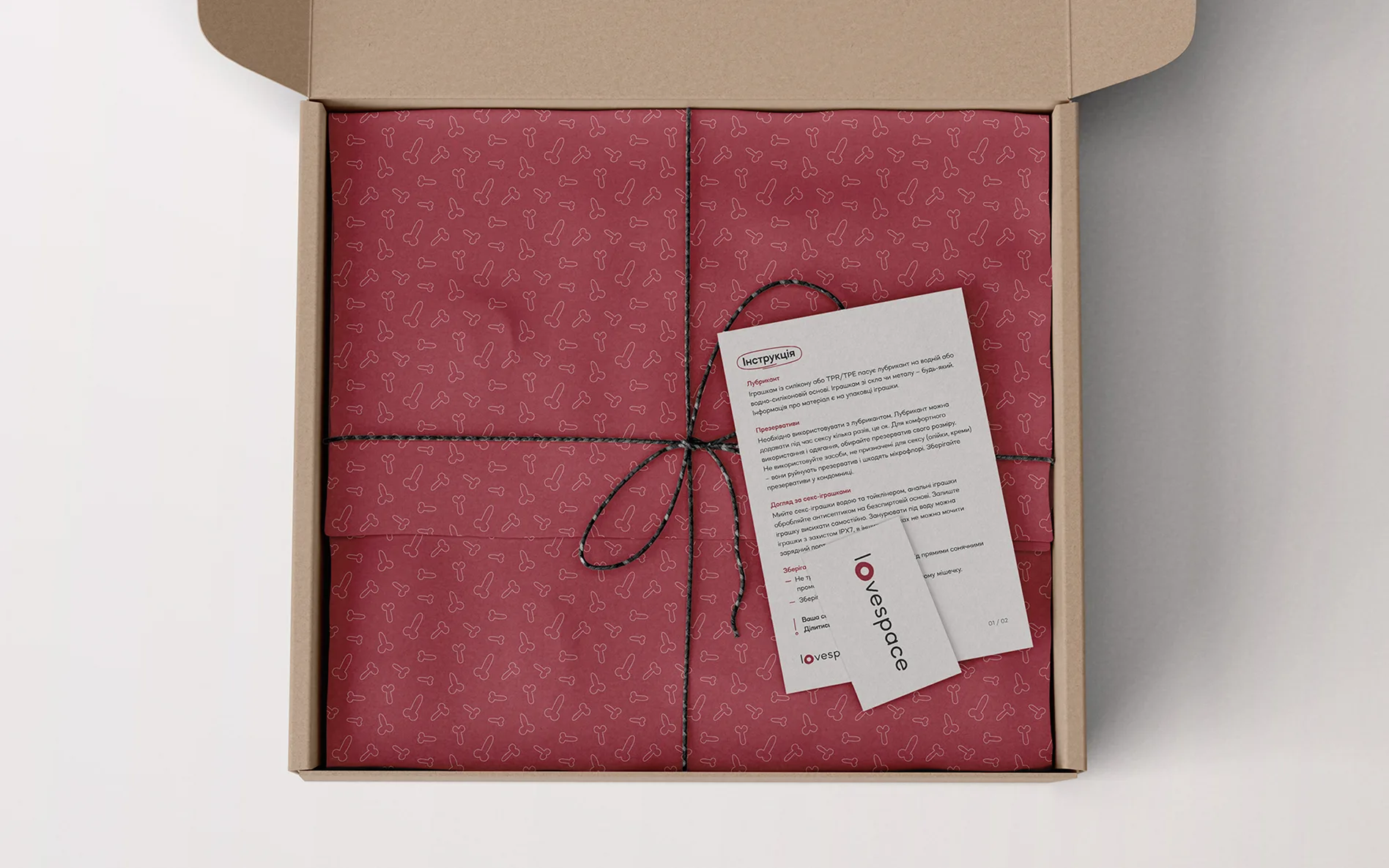
Lovespace — a space for sexual products, knowledge, and experimentation for people ready to embrace who they are.
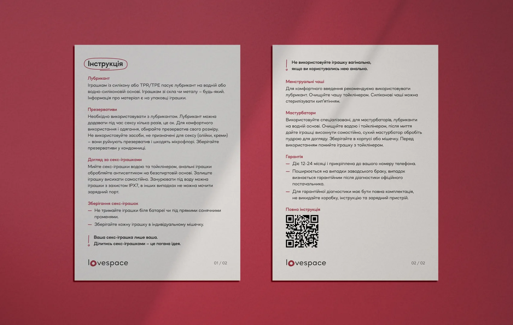
The challenge was to refresh the Lovespace visual identity without losing its recognizability or emotional connection with the audience. To maintain trust while giving the brand a new, contemporary, open, and warmer voice. An identity that feels alive.



Brand philosophy
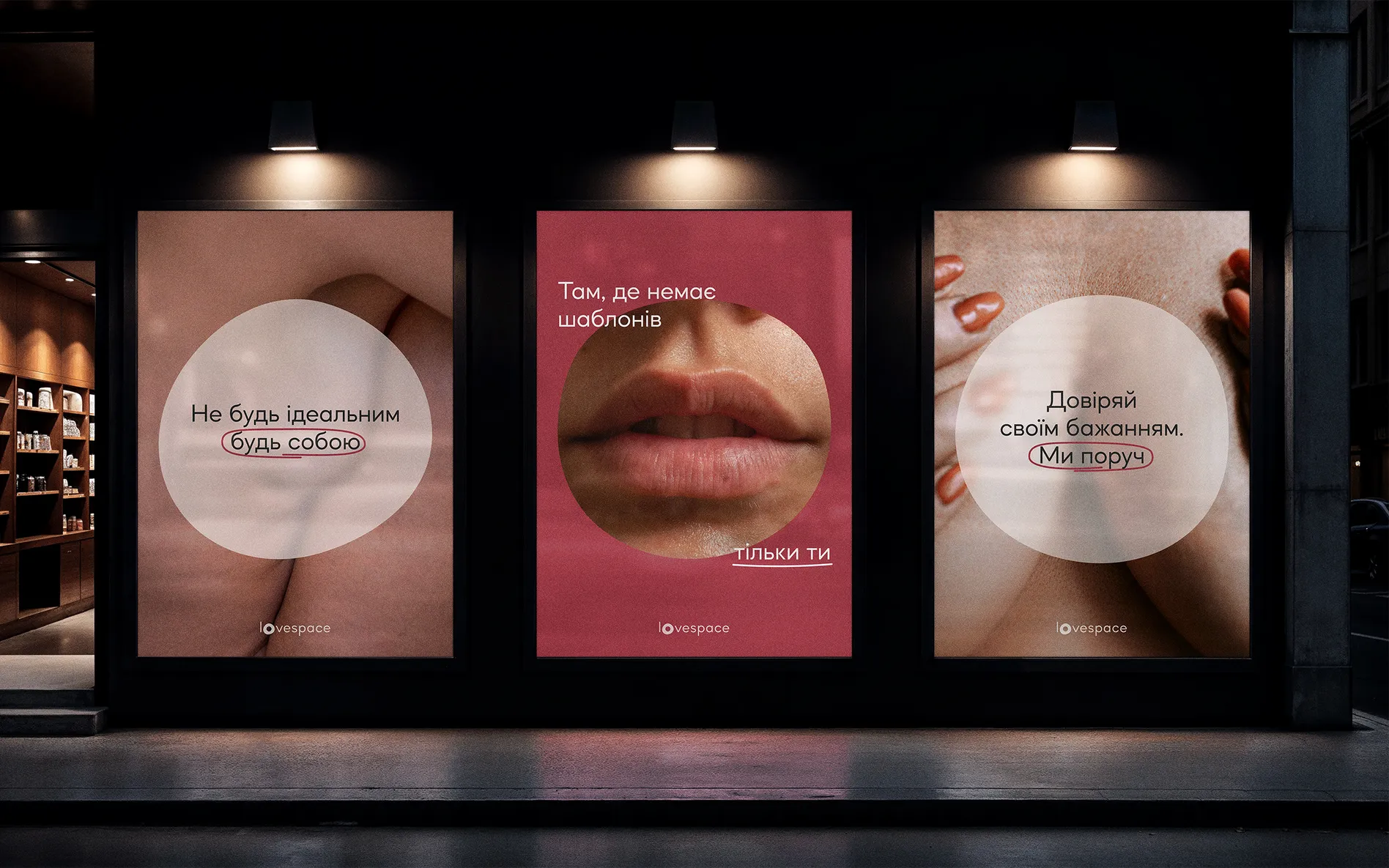
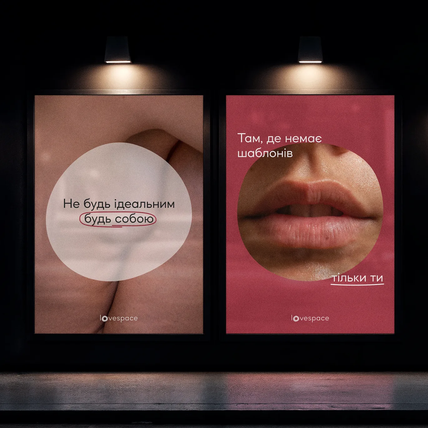
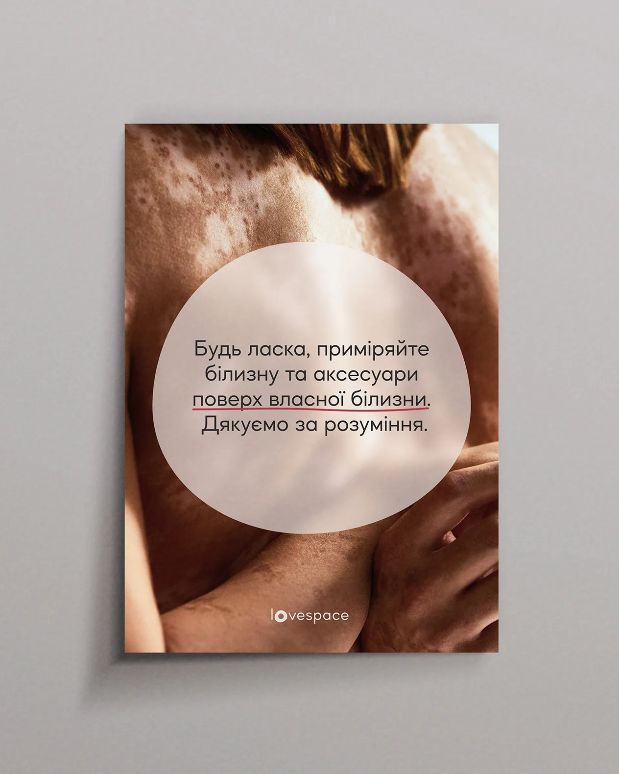
Life is imperfect, and sex is no exception. Sex is not about standards, but about experimentation, sometimes about laughter and vulnerability, moments that become meaningful.
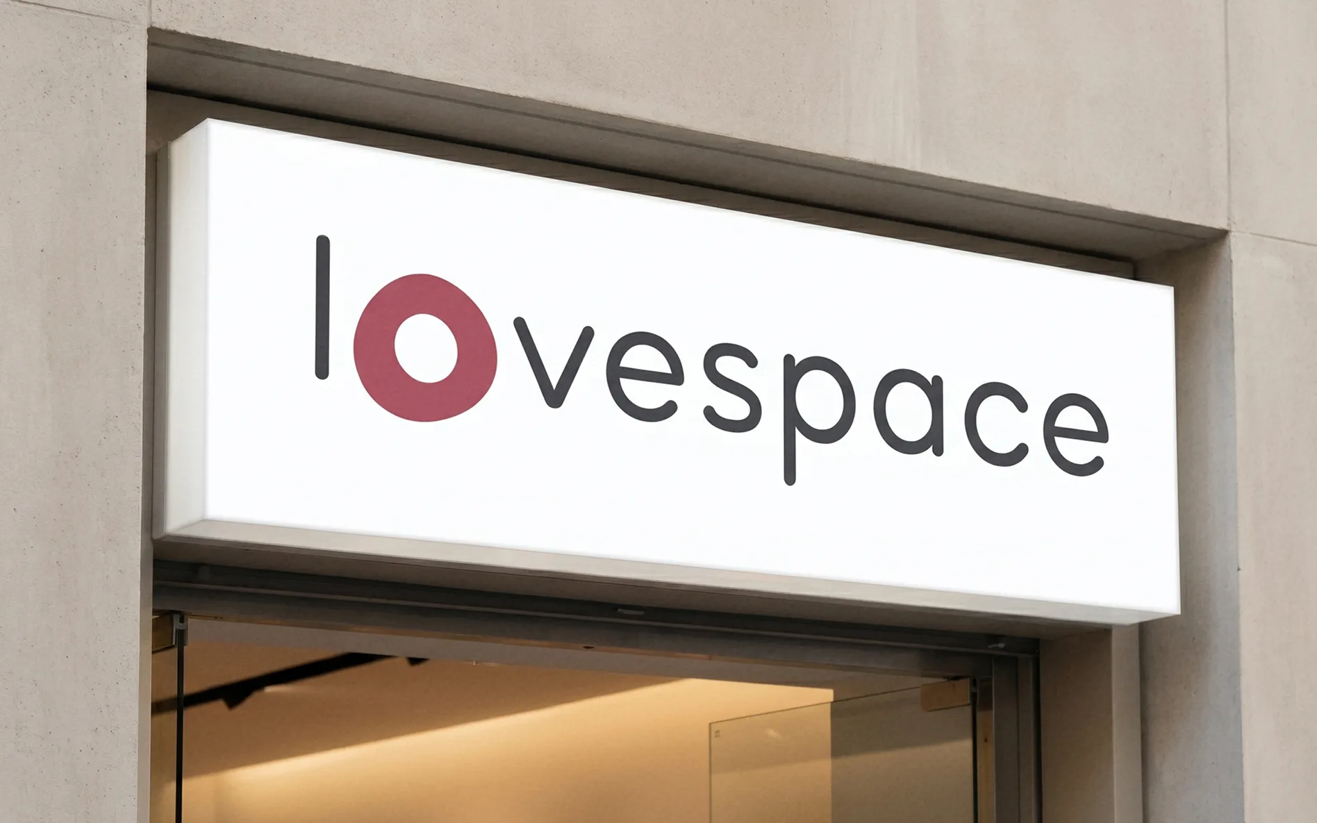
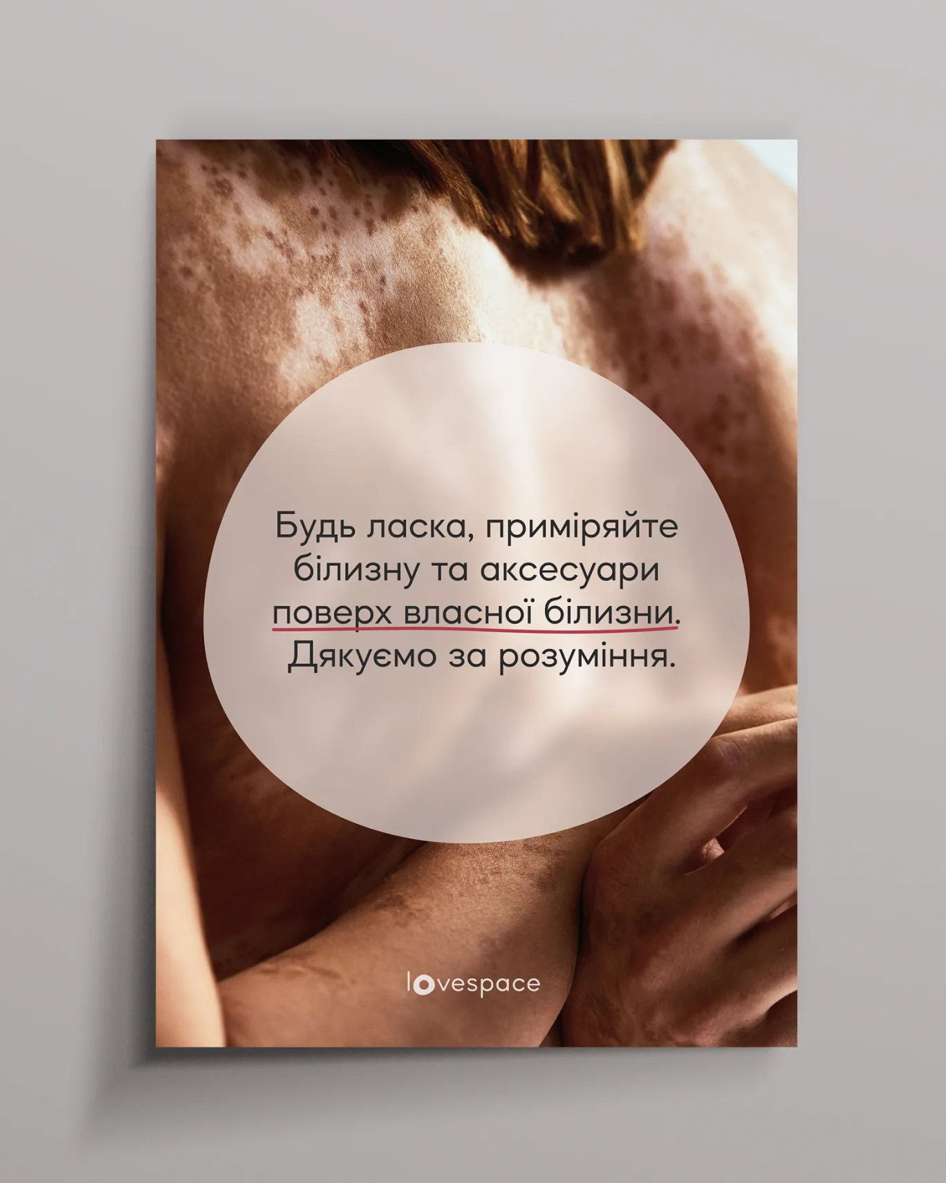
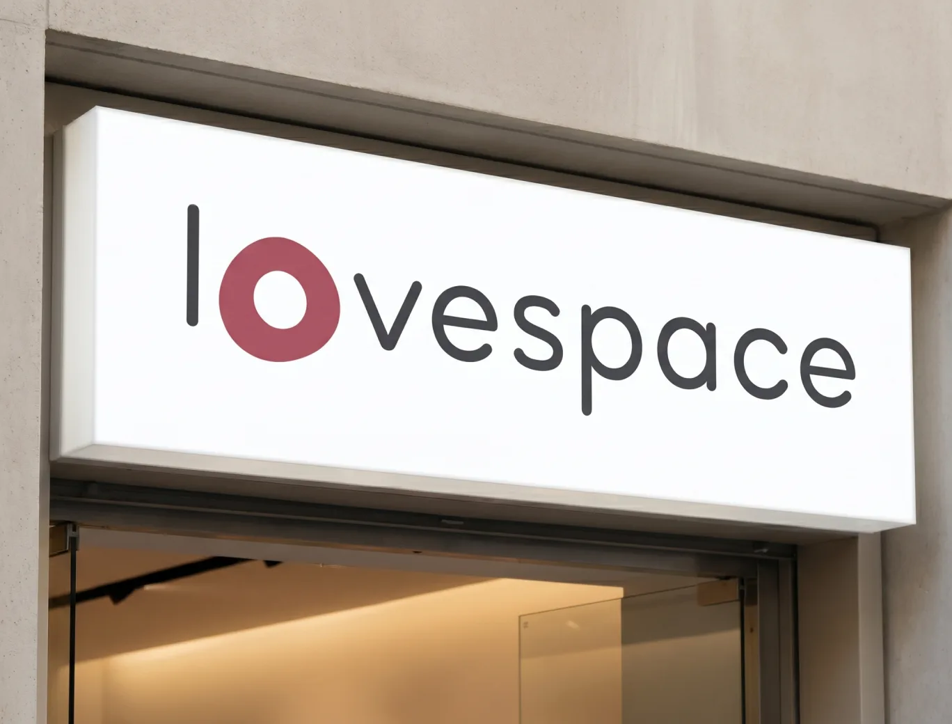
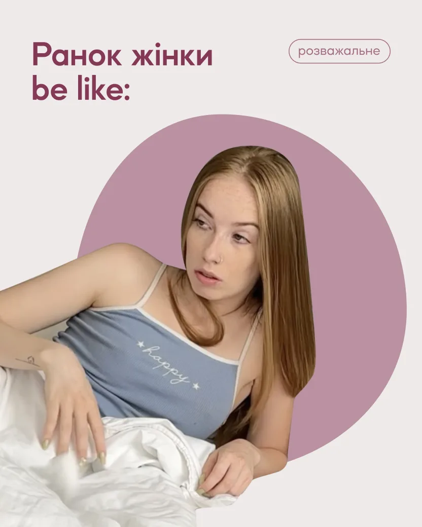
The circle remains at the core of the visual identity, but it is no longer perfect.


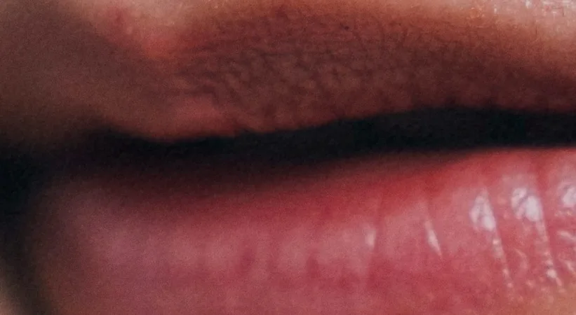
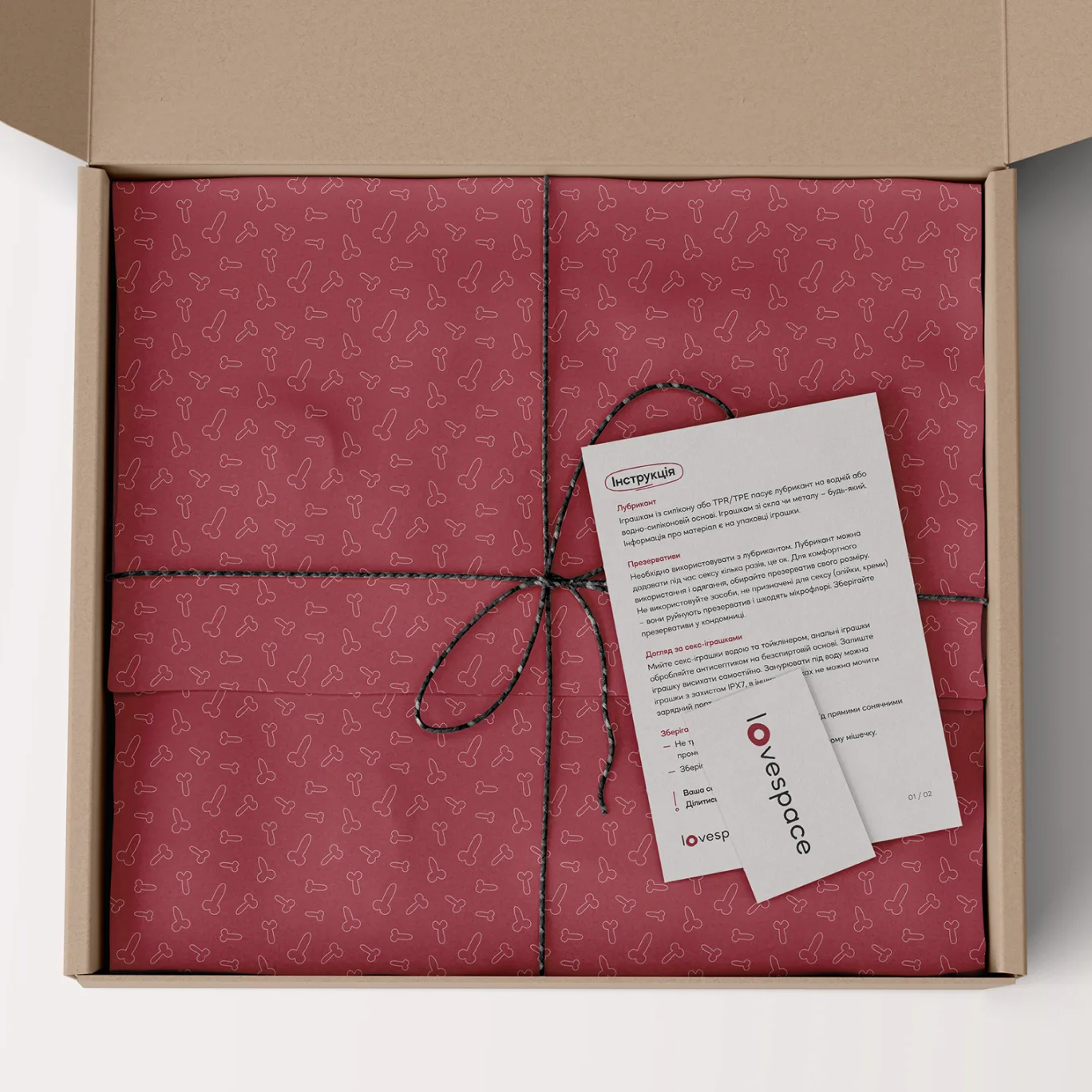
Kissed Lips
HEX: A23C49
RGB: 162, 60, 73
CMYK: 0, 63, 55, 36

Skin Shadow
HEX: 2A2A2A
RGB: 42, 42, 42
CMYK: 0, 0, 0, 84

Soft Skin Light
HEX: EEEAE9
RGB: 238, 234, 233
CMYK: 0, 2, 2, 7





Extended palette
Inspired by the brand’s product range, these colors continue the same soft, organic direction. They add flexibility across social media, content categories, and educational projects.
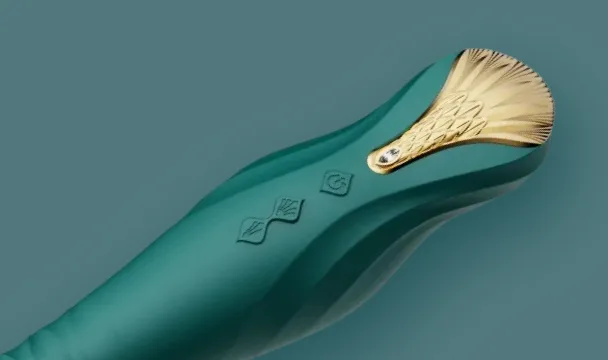
HEX: 25575C
RGB: 37, 87, 92
CMYK: 60, 5, 0, 64

HEX: 2A3D73
RGB: 42, 61, 115
CMYK: 63, 47, 0, 55
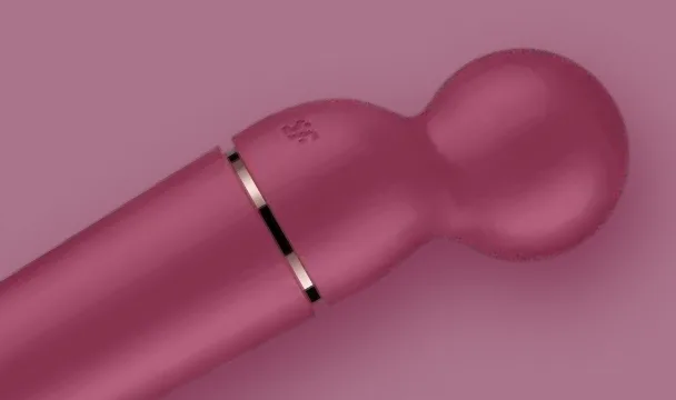
HEX: 853857
RGB: 133, 56, 87
CMYK: 0, 58, 35, 48

HEX: 5E3C69
RGB: 94, 60, 105
CMYK: 10, 43, 0, 59


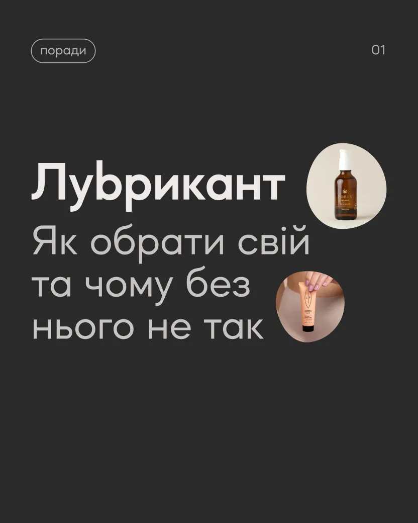
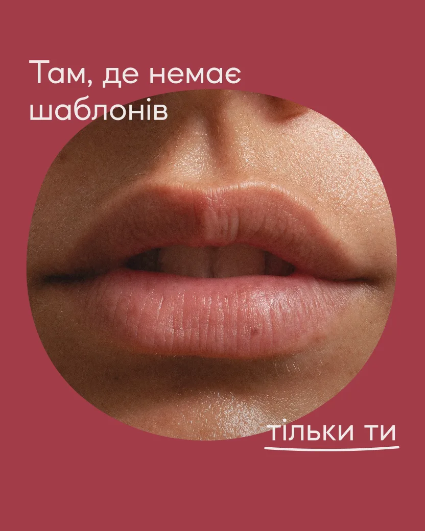

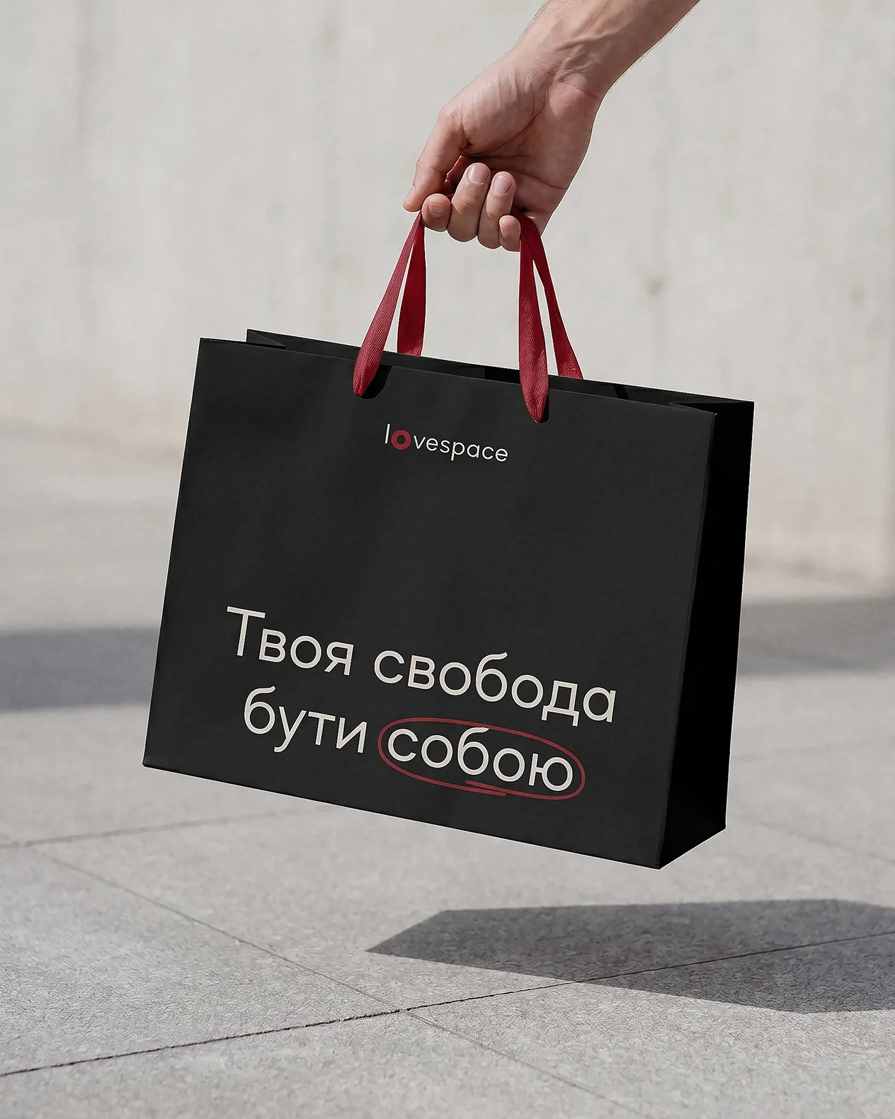
Brand phrases
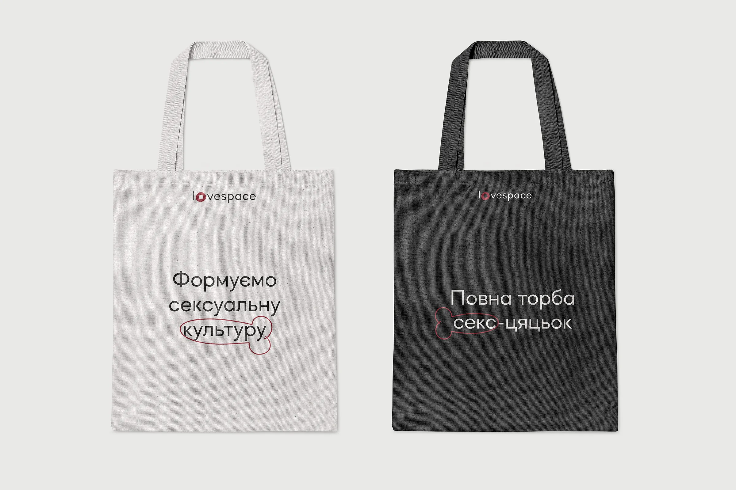
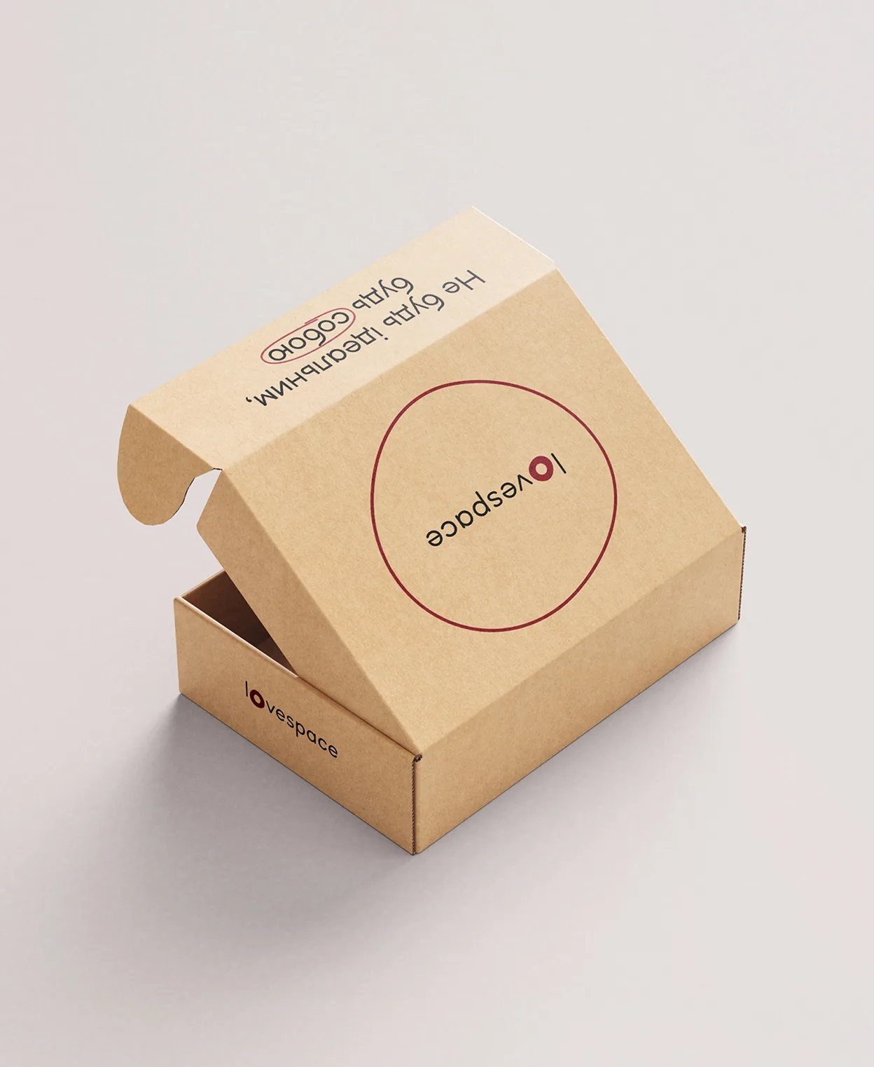
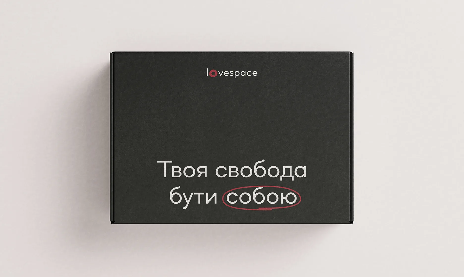
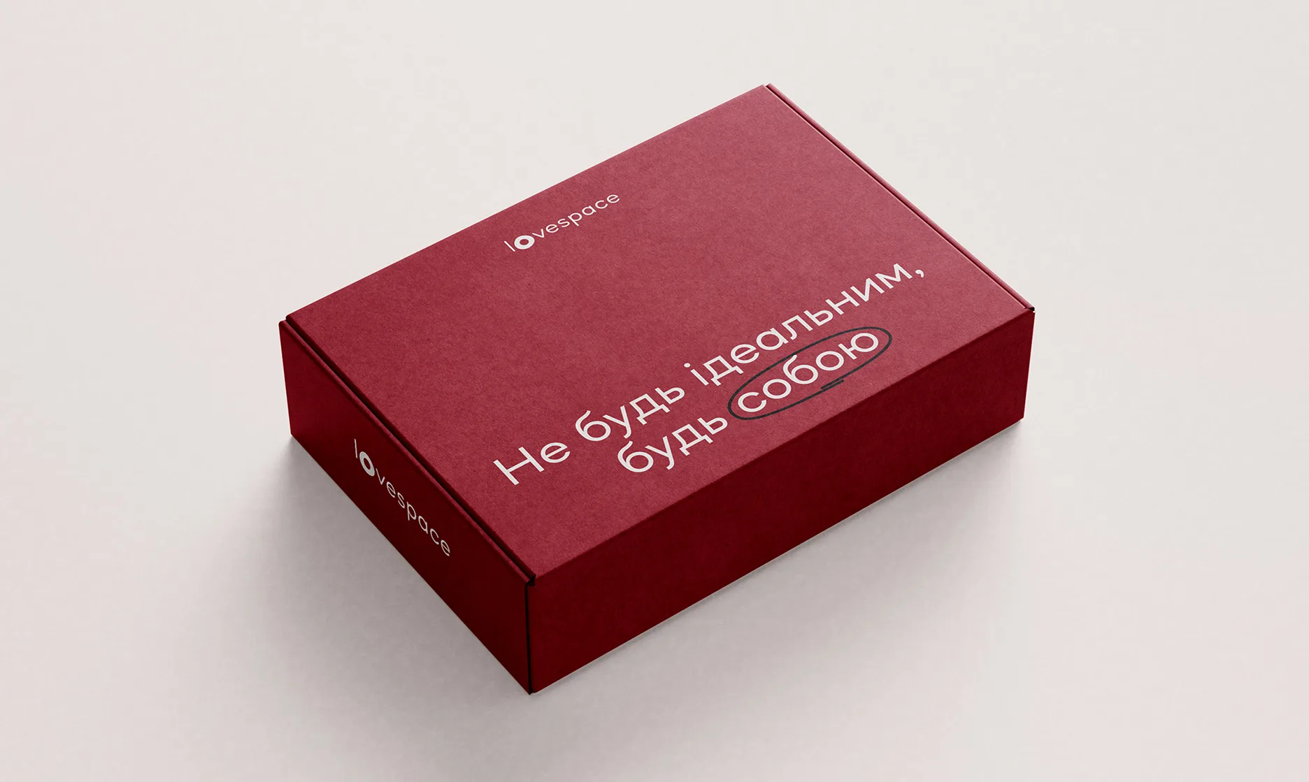
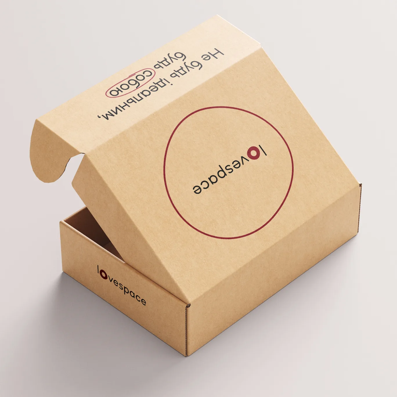
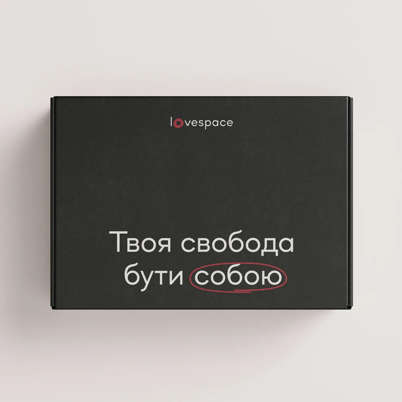
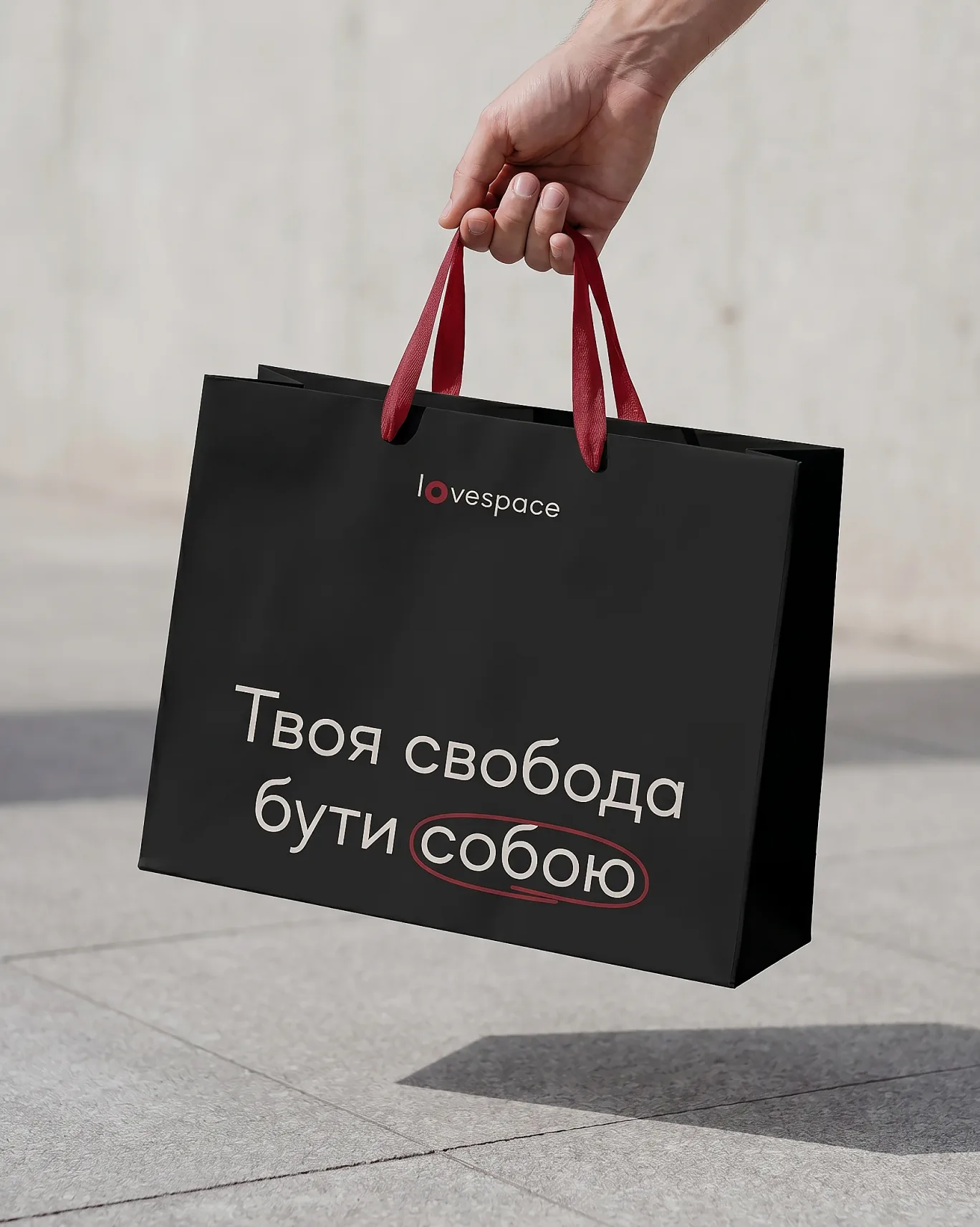
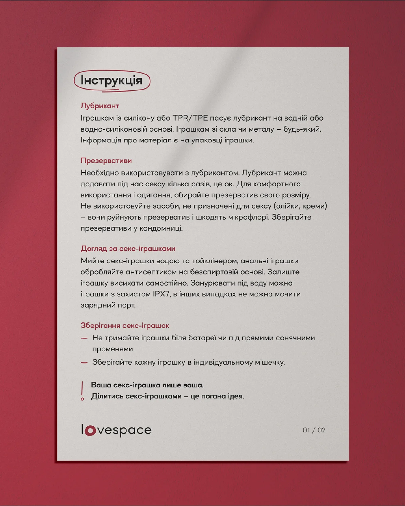
Lovespace already had a set of recognizable phrases that were closely connected to the brand and its community. I kept them in the updated identity to preserve this connection with the previous visual language, while giving them a new graphic treatment across merchandise and other brand materials.